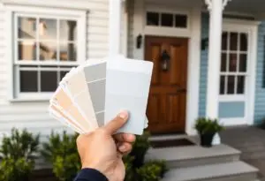
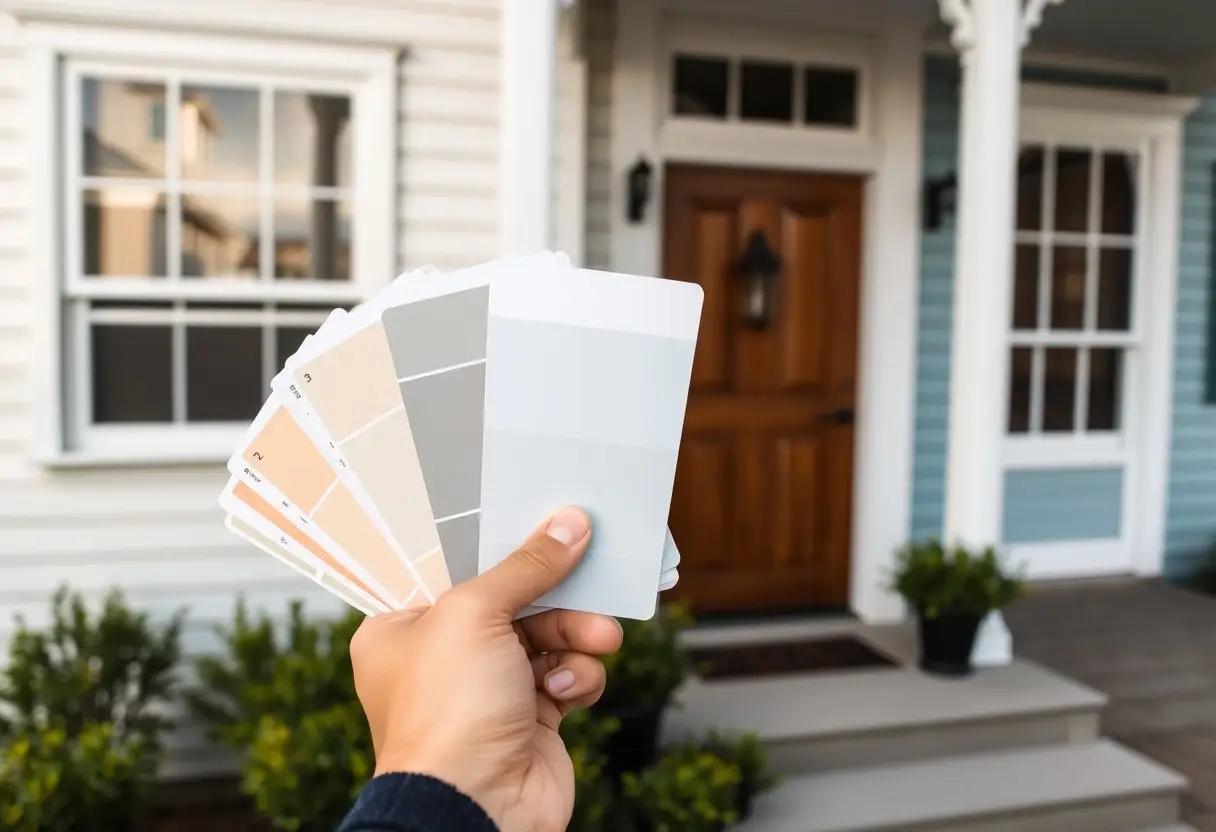
Overlooking the wrong paint color can dramatically alter the mood and perception of your space. You need hues that reflect your home’s architecture and era while enhancing natural light. Choosing the right shade means understanding undertones, testing samples, and aligning with existing finishes. The right color brings harmony, depth, and a lasting impression.
Identifying Key Architectural Style Factors
Understanding your home’s architectural style shapes every color decision you make. Look for clues in rooflines, window shapes, and exterior trim-each reveals period-specific design intent. Assume that style authenticity guides cohesive, timeless paint choices.
Analyzing Structural Lines and Historical Periods
Study how vertical or horizontal lines define your home’s silhouette. Craftsman bungalows favor low-pitched gables, while Victorian homes boast ornate peaks. These structural cues link directly to historical eras. Assume that form follows period, and color should follow form.
Evaluating Fixed Elements and Material Textures
Brick, stone, or stucco finishes limit your palette-they’re permanent and dictate harmony. Notice how texture affects light and color perception. A rough stone accent reads darker than flat paint. Assume that your paint must complement, not compete with, these elements.
Fixed materials like exposed beams, masonry, or hardwood floors anchor your space visually. These textures absorb or reflect light differently, altering how paint appears throughout the day. Matching hues to these elements ensures balance and depth. Assume that ignoring texture leads to unexpected, jarring contrasts you’ll see every time you walk into the room.
How to Use Color Theory for Style Alignment
Color shapes how your space feels, even when you don’t notice it. By aligning your home’s style with foundational color principles, you create harmony between design and emotion. Choosing the right palette isn’t about trends-it’s about intention. Match your aesthetic goals with strategic hues to let your home express its true character.
Selecting Palettes Based on the Color Wheel
Combinations from the color wheel guide balanced, cohesive choices. Analogous tones bring calm and flow, while complementary pairs add dynamic contrast. You can reflect your style-whether traditional or bold-by selecting schemes that mirror its energy. Stick to three colors max for clarity and impact.
Understanding the Impact of Warm and Cool Undertones
Undertones shift how paint appears under different light. Warm undertones create intimacy and comfort, ideal for traditional or rustic styles. Cool undertones lend calm and spaciousness, suiting modern or coastal aesthetics. Test swatches at multiple times of day to see their true effect.
Light changes everything-what looks neutral at noon may glow pink at sunset. Warm undertones like red, yellow, or peach add energy and make a room feel cozier, often enhancing wood finishes and earthy textures. Cool undertones with blue, green, or gray bases promote serenity and can make small spaces appear larger. Your choice here can either support or clash with your home’s architectural style and existing materials, so always evaluate paint in context, not isolation.
Assessing Environmental Lighting Factors
Lighting dramatically affects how paint colors appear in your space. Consider both natural and artificial sources when selecting hues.
- North-facing rooms receive cool, indirect light
- South-facing areas get strong, warm sunlight
- Evening lighting can shift color perception
This shapes how your chosen palette feels throughout the day.
Observing the Influence of Natural Light Direction
East-facing walls glow with warm tones in the morning but turn cooler later. West-facing rooms bask in intense afternoon sun, deepening color saturation. Natural light direction alters how pigments look at different hours. This defines the true behavior of your paint.
Accounting for Artificial Light and Evening Ambiance
Incandescent bulbs add a yellow cast, while LEDs can lean blue or warm depending on temperature. Your evening ambiance hinges on how these sources interact with walls. Artificial light can distort or enhance paint tones after dark. This determines how inviting your space feels at night.
Lighting from lamps, ceiling fixtures, and screens plays a bigger role than many realize. A warm 2700K bulb will soften grays into beiges, while cooler bulbs can make a creamy white appear stark. Layering light sources-task, accent, ambient-gives you control over how paint colors perform when the sun goes down. This ensures your walls look as intended, no matter the hour.
How to Create a Cohesive Whole-House Palette
Designing a harmonious color story across your home starts with selecting a base palette that reflects your style and flows naturally from room to room. Sticking to a consistent undertone in your paint choices ensures visual continuity, even when hues shift. You’ll create a calming, intentional atmosphere that feels unified, not disjointed.
Establishing a Unified Flow Between Rooms
Paint each space with colors that share the same family or lightness level to maintain a smooth visual rhythm. Open-concept areas benefit most when adjacent walls use complementary shades rather than stark contrasts. This subtle blending keeps your home feeling spacious and thoughtfully connected.
Choosing Transition Colors for Hallways and Entrances
Use neutral or softened tones in hallways and entryways to act as visual buffers between bolder rooms. These spaces set the tone for what’s ahead, so opt for hues that welcome and guide. A well-chosen transition color prevents jarring shifts and supports overall balance.
Think of hallways and entrances as the connective tissue of your home’s design. Since these areas are often narrow or receive limited natural light, selecting a paint color with balanced warmth and mid-tone depth prevents them from feeling dark or closed in. A shade like warm greige, soft taupe, or muted sage works well-it’s unobtrusive yet intentional, allowing adjacent rooms to shine while maintaining a steady, inviting progression throughout the house.
Professional Tips for Testing Paint Samples
Smart paint choices start with real-world testing.
- Always test large swatches, not small chips
- Observe colors on multiple walls to assess depth
- Monitor how natural light shifts the pigment
- Use sample pots for accurate application
Any decision made without seeing the paint in your space risks a costly mismatch.
Applying Large Swatches to Multiple Walls
Painting broad sections across different walls reveals how color behaves in varied lighting. Small samples mislead, but large swatches show true undertones and depth. You’ll notice contrasts between sunlit and shaded areas, helping you avoid surprises. Any hesitation fades when you see the full effect.
Monitoring Pigment Changes Throughout the Day
Light alters how your eye perceives paint color, sometimes dramatically. A warm beige at noon may look cool and flat under evening lamplight. Watch how the pigment shifts from morning to night. Any consistent hue across all conditions is likely your best match.
As sunlight moves across your rooms, the angle and intensity change, directly affecting how color appears on your walls. North-facing rooms receive cooler light, muting warm tones, while south-facing areas amplify brightness and can exaggerate yellows or reds. Artificial lighting at night-especially from LEDs-can introduce blue or orange casts that distort the original pigment. This is why observing your sample over several days, at different hours, gives you a true sense of its behavior. Any truly reliable color stands up to these shifts without losing its character.
Coordinating Colors with Furniture and Decor
Choose paint hues that harmonize with your existing furnishings by pulling tones from key pieces like rugs, upholstery, or artwork. This creates a cohesive flow and prevents your walls from clashing with dominant colors in the room. A well-matched palette enhances comfort and visual appeal, making your space feel intentional and lived-in.
Balancing Bold Accents with Neutral Foundations
Anchor vibrant decor with soft, neutral wall colors like warm gray, beige, or off-white. These tones give bold furniture or accessories room to shine without overwhelming the senses. Neutral backdrops create balance and prevent visual fatigue, letting your standout pieces become intentional focal points.
Matching Paint Values to Existing Textiles and Wood
Align the lightness or darkness of your paint with that of your curtains, throws, or hardwood floors. A mismatch in value can make a room feel disjointed, even if colors seem to coordinate. Selecting paint with a similar depth ensures harmony and ties the space together naturally.
When matching paint values to textiles and wood, focus on how light or dark a color appears, not just the hue. A deep navy curtain or rich walnut floor should pair with a wall color of comparable intensity to maintain equilibrium. If your fabrics are light and airy, go for softer paint values to preserve that openness. Ignoring value contrast can unintentionally make rooms feel unbalanced or choppy, even with a “perfect” color match on paper. Test swatches at different times of day to see how natural light affects the relationship between your walls and furnishings.
Final Words
Drawing together your home’s architecture, natural light, and existing furnishings guides your paint choices with confidence. You shape atmosphere and continuity when color aligns with style. Trust your instincts, test samples in real conditions, and let each room reflect the character you live with every day.
FAQ
Q: How do I pick paint colors that suit my home’s architectural style?
A: Start by identifying the era and design elements of your home. A Victorian house often looks best with rich, layered colors like deep greens or warm burgundies that highlight ornate trim. Mid-century modern homes pair well with earthy tones like olive, rust, or muted teal, which complement wood accents and clean lines. Farmhouse or cottage styles shine with soft whites, warm grays, or muted blues that create a relaxed, timeless feel. Look at historical color palettes for your home’s period or browse photos of similar homes for inspiration. Test samples on multiple walls to see how natural light affects the shade throughout the day.
Q: Should I use the same color scheme throughout my whole house?
A: Not necessarily. Open-concept homes often benefit from a cohesive palette using variations of the same base tone to maintain flow. For example, a warm greige in the living room can shift to a slightly deeper version in the dining area. Homes with defined rooms can support more contrast-try a calming blue in a bedroom and a warm terracotta in a hallway if it fits the mood you want. The key is balance. Use a dominant color as a thread through main living areas, then adjust saturation or undertone in private spaces. Always test how adjacent colors look when viewed from one room into another.
Q: How do I make sure the paint color works with my furniture and flooring?
A: Bring home large paint samples or order peel-and-stick swatches to view in your space. Hold them next to your sofa, rug, or hardwood floors at different times of day. If you have warm-toned wood floors, pair them with colors that have warm undertones-like cream, peach, or taupe-to avoid clashing. Cool floors, such as gray stone or cool-toned laminate, go well with blues, greens, or grays that have a slight blue or purple base. Neutral furniture gives you more flexibility, but if your sofa is a bold color, choose wall tones that either complement or intentionally contrast it-like pairing a mustard yellow sofa with deep charcoal or soft sage walls.